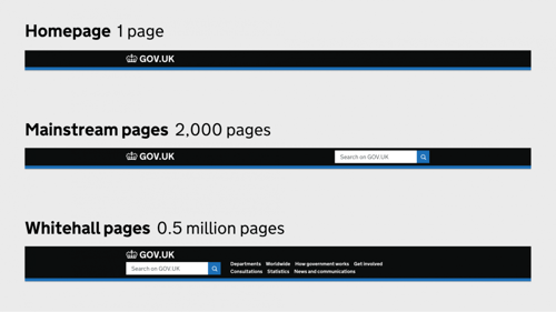
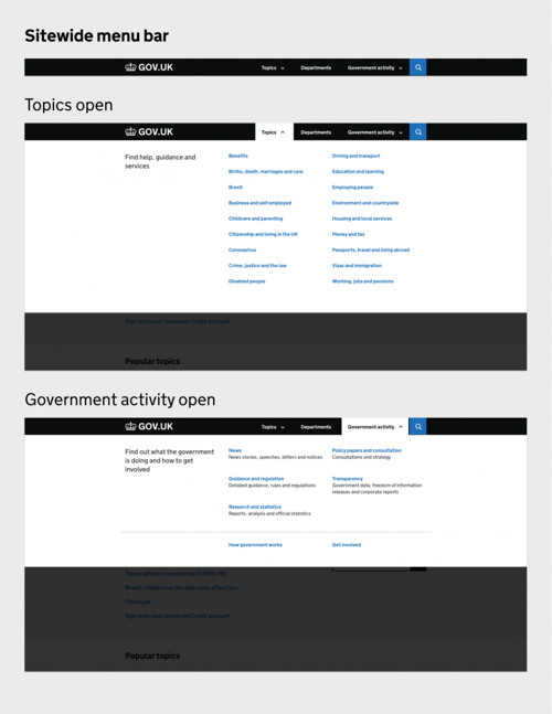
GOV.UK has started to roll-out changes to its menu bar for some users to A/B test a new design that makes it easier for people to find what they need on the pan-government services portal.
GOV.UK is made up of more than 500,000 pages, and has averaged 17.8 million users a week in 2021.
This scale of the site, and the range of user needs, means ensuring people can find what they’re looking for is a priority for the Government Digital Service (GDS), which is responsible for maintaining and developing government information and services on GOV.UK.
The navigation of GOV.UK has previously changed very little since 2014, and a review in February 2020 discovered that the information architecture of GOV.UK was confusing for both users and the civil servants responsible for adding content - with a complex and duplicate range of mainstream, specialist and taxonomy topics.
At the same time, there was a need to streamline the experience for the majority of users accessing via smart phones.

Currently GOV.UK has three different menu bars depending on what kind of page you are on. In the prototype GDS is testing a simpler but more versatile menu that would provide consistent navigation on every page of the site. This would provide clear routes to browse by topic, department or content type.

As information architecture changes could impact the way that departments curate and tag content, GDS says that it is "committed to working closely with departmental content teams should any changes be needed and ensuring these don’t add to their workload".
For this reason, any changes will represent a simplification of the content tagging and topic curation process, as well as an improvement to the user experience.
